
The World through Media
How does media influence our vision of the world ?
EPFL ADA Project by Alice Bizeul, Johan Cattin & Laure Font
EPFL ADA Project by Alice Bizeul, Johan Cattin & Laure Font
In a society where individuals are constantly connected through their phone, radio, computer, TV, the door to the outside world has never been more wide open. People have constant instantaneous access to news about events taking place in their own town, as well as events thousands of miles away. This access to information is achieved through social networks like Twitter or Facebook, as well as through the media. As such, the media choose how the information will be relayed to the world. They can also select which events will be transmitted to the readers and watchers, whether they are real or not, giving them the power to influence the vision people get of their environment. Take the example of the 2016 presidential campaign, where fake news that Clinton approved weapons sales to Islamic jihadists shifted the preference of voters toward Trump rather than Clinton.
In our project, we intended to evaluate the way media influence our perception of the world. We used the GDELT 2.0 database, which monitors the news media around the globe in more than 100 languages from a growing number of broadcast, print, online sources. Every 15 minutes, it records all mentions of events from more than 99'000 news sources, as well as the characteristics of the events, such as the type of event, the country and time it took place and the Goldstein score, which is the an index estimating the impact an event has on a country's stability. For each mention, the database records various parameters including the time the mention entered the database, the type of source (web, broadcast….) and the source of the document. The mentions we have access to were recorded between February 18th 2015 and September 9th 2017. The result of this continuous recording is a tremendous amount of data.
We first explored the dataset, to see what we would have to deal with. Because mentions can refer to events which happened minutes ago as well as to events which happened months ago, some events referred to in the mentions took place before the beginning of the recording. Their first mentions were thus not recorded in the database. Likewise, the events taking place at the end of the recording had less chance to be mentioned. In order to give each event the same weight in terms of related mentions, only the events taking place after February 18th 2015 and before July 9th 2017 were retained.
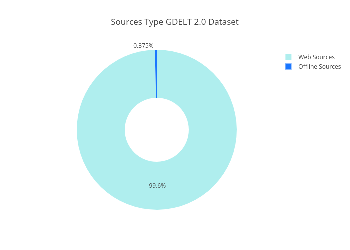
We found out that most of the sources were web sources and that offline sources were only slightly represented. The prevalence of web sources was expected as they a easily accessible and they have been flourising during the past decades To support this supremacy of web sources, the first ranked source was the web portal yahoo.com with more than 18 millions mentions, whereas the second source only had 1.8 millions. This is coherent with the fact that yahoo was rated the most widely read news and media website in 2016 by the web traffic analysis company Alexa. On top of that, after a manual check due to the absence of geographic localisation of news reports, we found that although most sources had their headquarters in the United States. This there were still sources from other countries as the UK, Australia, India .
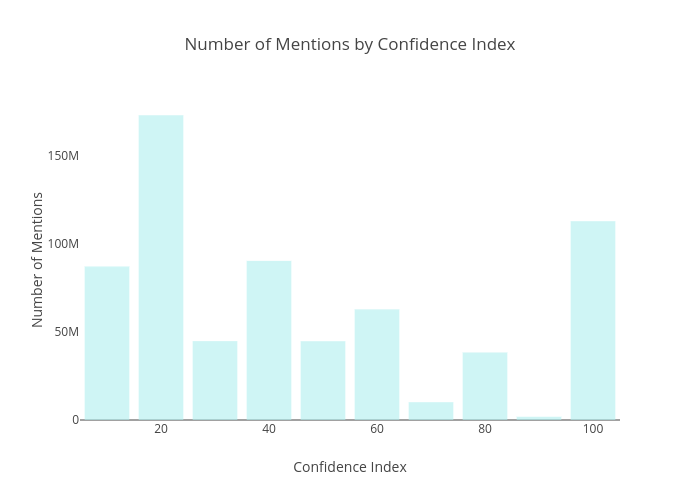
We then looked at the confidence of each mention. This value represents the estimation of the confidence at which an event is extracted from a news report. The confidence is higher for news report which focus on an event, whereas it is lower for reports which only briefly describe the event. The original language of the news report can also affect the reliability of the information extraction. Half of the mentions were recorded with less than 50% confidence and one third of the mentions were recorded with less than 20% confidence. Most events thus required hard work from the algorithm to detect them, rendering the accuracy of the extraction weaker. Since our analysis focused on the number of mentions per event and since the database contained millions of mentions, the mentions with less than 20% confidence were removed, in order to keep only the reports that we could trust. This resulted in a decrease of the number of mentions coming from news reports using less common languages and giving more prevalence to news reports using english but was, according to us, necessary in order to strengthen the reliability of our results.
As our analysis focused on the events reported by the news in different countries, we represented for each month in each country the human activity relayed by the news and the media coverage of these events. This allows us to get an overview of mediatic and human activity reported by our data. To make sure events which occured early on in the time period recorded by the database weren't over-represented due to their longer 'life span', the media coverage, in order words the number of times they were reported in media, was restricted to 2 months following the first time they were recorded. This time period was chosen after observing the mediatic life span of events. The mediatic attention they perceives is mostly limited to a couple of weeks, this time restriction does therfore not affect our vision of the mediatic attention perceived. The mediatic coverage gives an insight on the importance given to the event. Indeed, if an event receives more mentions, we would expect that it is of great importance. In order to give an even better insight at the value given to an event on the mediatic scene, we wanted to evaluate the mediatic attention of an event, that is the number of mentions related to an event during a certain period, with respect to the total number of mentions during the same period.
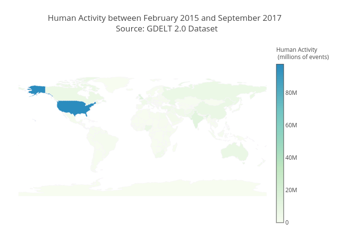
However, since we observed that the total number of mentions worldwide was stable throughout the months, we decided to keep the mediatic coverage as a measurement of the value given to an event. The human activity, on the other hand, represents the events mentioned in the news. In this way, it does not portray all events taking place in the country, but only what is relayed by the media. However, we assume here that it is an accurate representation of what is happening in a country as we can consider that each event should be at least mentioned once on the international mediatic scene.
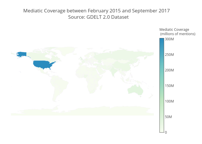
What jumps to the eyes on these two maps is the prevalence of the United States in both human activity and media coverage. Even though they are the 3rd biggest country in terms of surface area and number of inhabitants, they have no particular reasons to be that prominent in the news. This indicates a bias in our dataset as most of the recorded events took place in the USA and therefore a very large portion of mentions cover events related to the uses. This prevalence of the US was partially explained earlier with the confidence measurement and the origin of sources analysis. Other countries which stand out on these maps are the English-speaking countries (Australia, Canada, United Kingdom) as well countries like India, China, Russia, Nigeria among others. Another observation that can be made is the synchronisation between the human activity depicted by the database and media coverage perceived.
After this first overview, We evaluated the relationship between the news related to an event and the Goldstein scale of the event, which as written above, the theoretical impact the event could have on a country and most importantly on its stability. this index is ranged between -10 and 10. A lower score indicates more potential for the event to destabilize a country, whereas a higher score indicates a trend for the event to lead to or maintain the country’s stabilization. We wanted to observe whether the Goldstein score of an event was proportional to the number of mentions it received, to see whether the media would give more weight to the destabilizing events than the positive ones. We observed that the average number of mentions per event for each Goldstein score was more or less constant.
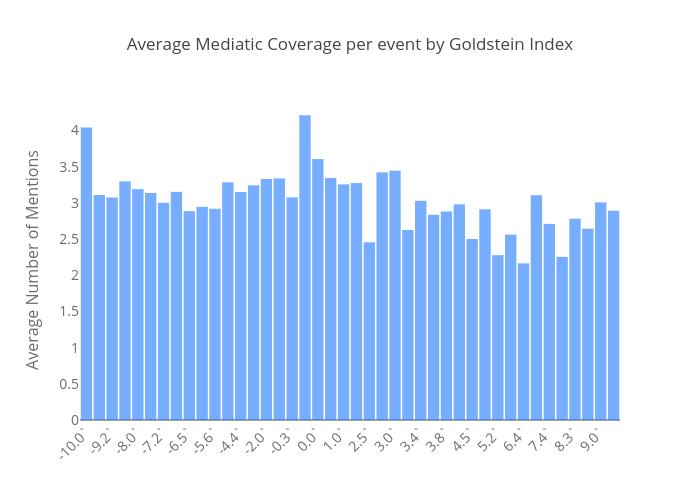
Thus, there did not seem to be any significant relationship between the Goldstein score and the media coverage. This lack of relationship was also displayed when selecting 5000 events and representing for each of them their mediatic coverage and Goldstein score. In order numerically assess this relationship, Pearson and Spearman coefficients were evaluated on 70’000 events, to have a reliable estimation with enough samples. Pearson coefficient indicates whether there is any linear relationship between the two variables, whereas Spearman indicates whether there is any monotonic relationship. Both methods returned values close to 0, suggesting the absence of any relationship between the two variables. This indicated that an increase in the potential of an event to stabilize the related country did not lead to an increase of the attention media gives to an event, or the opposite.

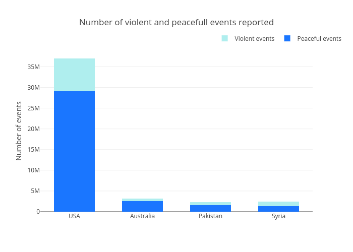
To go deeper in the analysis of the influence of the characteristics of an event on the mediatic attention it receives, and find out whether the countries are discriminated in term of mediatic attention, we focused on 4 countries. The selected countries were the USA because they are highly prominent in the media and are really active in terms of human activity according to the news, Syria as it has been a country at war since the Arab Spring protests and is thus expected to be unstable and present in the media, Pakistan as it has been the target of terrorist attacks in the recent years and would be expected to be a main subject in the news, and Australia as it is an occidental country in the South hemisphere.
For each of these countries, the number of events as well as the media coverage were represented throughout the months. Also represented were the numbers of what we considered violent and peaceful events. Violent events were assault, fight and mass violence whereas peaceful events were public statement, appeal and expression of intent to cooperate. This classification was made possible thanks to the CAMEO code provided for each event in the database. Each code is related to a specific type of event ranging from very violent events to events conveying peace.
For all countries, there were more peaceful than violent events and the evolution of peaceful events was similar to the evolution of the media coverage throughout the months. The proportion between violent and peaceful events was higher in Syria, in accordance with the conflict which has been taking place there for years. As observed on the map, an excedance of events and media coverage was displayed by the USA, which is due to the bias of the database which mostly considered american sources. The Goldstein scores were lower for Syria and Pakistan, which was consistent with the instability of these countries.
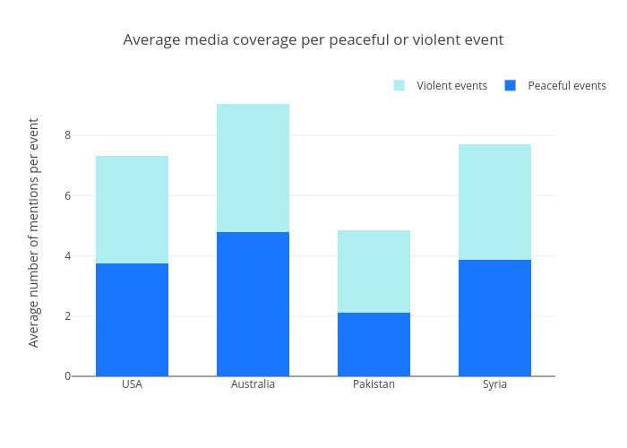
What was also interesting was that even though Pakistan and Syria had similar global activity as Australia during the 2 years, they received less mediatic attention. The fact that the database considered more australian than pakistani and syrian news sources might be responsible for this, similar to the USA. This might also display that even though Australia is in the South hemisphere, it is more represented in the news than less developed countries. What’s more, a downward peak of the Goldstein was usually associated with a peak in violent events as well as in media coverage. Thus, even though no linear or monotonic relationships were observed between the Goldstein and the media coverage, a more negative Goldstein indicated more media coverage.
The average media coverage per pacific or violent event gave a better idea of the mediatic attention given to these extreme events. The difference in media coverage between the different countries confirmed that Pakistan received less mediatic attention than the other countries. The trend displayed was that violent events received more attention than peaceful event, which would be expected as they disrupt the equilibrium of the country and thus attract more medias. It also reflected a general behaviour of today’s society, a society of show where violence seems to boost print and audience. Open up the 20 minutes in the metro in the morning and you will see that most of the events are daily incidents like crimes, accidents…
In order to get rid of the discrimination between countries in terms of media sources considered by the database and thus in terms of a country’s overall media coverage, we selected a few media sources and looked at how they displayed the informations from other countries. Sources where hand-picted among most recurrent sources in the database. They were also chosen according to the type of information they state to relay (national as well as international information) as well as the significance of these sources on national mediatic scene. For each country (France, USA, Kenya, Russia) a single news source was chosen. We then evaluated the number of mentions of each country by this particular source with respect to the number of total mentions published by this same news source on the entire timespan. We were thus able to see how a media source relays the information from abroad to the population of its home country, and how it may affect an individual’s perception of the outside world. The selected sources were france24.com (France), kenyastar.com (Kenya), washingtonpost.com (USA) and rt.com (Russia).
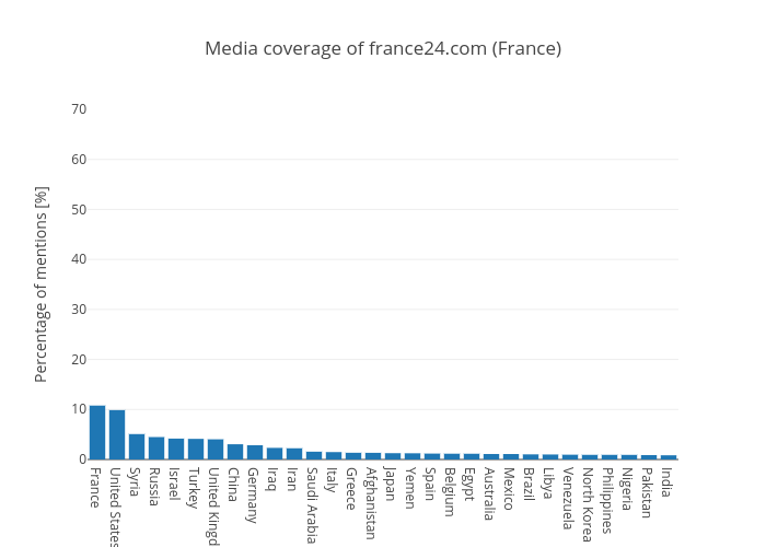
France24 is a French television network aiming to offer information about human activities and cultures worldwide, with a variety of point of views. As such, it does not only aims to relay informations about the most developed countries which neutralize a significant part of the international mediatic scene. Indeed, the representation of the countries in its news was distributed, with only 10% of mentions referring to France, giving an accurate insight to the French population of the activity worldwide.
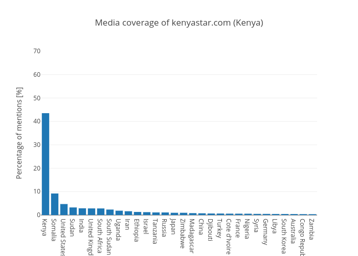
On the other hand, the Kenya Star online newspaper claims to focus its attention mainly on Kenya, while still relaying information about the African continent. Kenya Star is consistent with its initial intent since 45% of their mentions were dedicated to Kenya and most of the mentioned countries were in Africa (Somalia, Sudan, South Africa, Uganda…). As such, although they do not pretend to inform about the worldwide situation, they do not give a insights on what is happening around the globe but seem to stay relativly consistent with their initial objective.
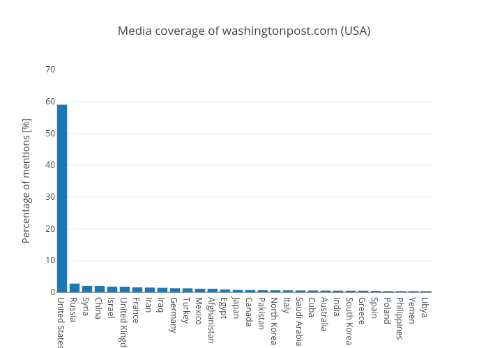
The Washington Post displayed significantly more information about the USA (60%) than about other countries. On top of that, the other mentioned countries were mostly developed countries from the North hemisphere. Thus, they mostly did not convey international news, even though they pretend to focus on the USA while giving news about the international scene. In the same way, for most major media sources in the USA, the claim to focus the attention on events abroad remains very secondary with respect to national content . Since they are reference source of news in the USA, one may reproach that they do not give an authentic representation of the world’s state to the American, limiting the population’s knowledge of the world and emphasizing the prevalence of the USA on the international scene.
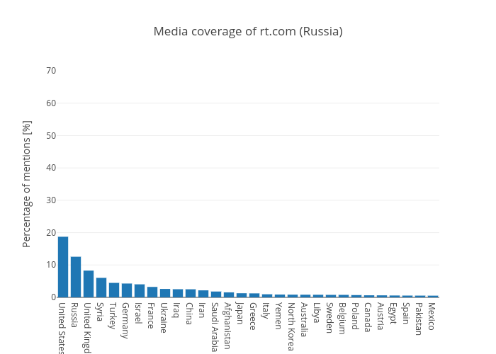
The two countries mentioned the most by RT, a Russian television network aiming to provide insights and information on major events worldwide, were the USA and then Russia. It was intriguing that a media wouldn’t first relay information about its origin country, but not surprising considering the strained relationship between the USA and Russia since
the Cold war, and considering RT has been accused of propaganda, of spreading disinformation and of breaching the rule of impartiality of media. The high prevalence of the US on RT articles could therefore be linked to this tendancy of this media channel to not only inform but also influence opinions and convey a specific and personnal message despite their official
objective.
This analysis highlights the biais generated by the media channel itself on the image of the world conveyed. Depending on the country and the sources, the informations conveyed to the inhabitants about the world is modulated. This filter applied to the international news
These results would require further analysis to further understand if this biais is mainly country dependant meaning can we find the same patterns in other news sources coming from the same country or is this biais mainly dependant on the news sources itself and the information
is wishes to convey regardless of where the news media is from.
As a conclusion, this project highlights some distorsions generated by news channels on human activity worldwide. Further analysis, using other datasets with a distribution of news sources less biaised towards the US for instance and performing more specific analysis should be made in order to identify more precisly and robustly the origin of the biais. The current analysis showed that overall the mediatic attention perceived by an event wasn't related to its impact on a country's stability. To the contrary, the geographic location of an event seems to have an impact on its coverage by news reports. Finally, insights were given on the impact of the news channel on the vision of the world it conveys. The geographic origin of the news source might be one of reasons for such behavior. Using multiple sources from the same country and comparing their behavior could be a good way to identify whether the geographical origin of sources and therefore the cultural biais has a strong influence on the information news channels choose to convey.
For more information regarding the processing pipeline applied to our data, please refer to our git repository containing all materials used througout this project